Oceanside Perspective
As the chief designer at Oceanside Perspective (OP), a non-profit knowledge-sharing organization, I led a diverse international team to develop OP's branding identity, including designing the logo, launching a digital learning platform, and creating social media templates to support its Kickstarter fundraising campaign.
Overview
✍️ My Role
Chief designer
👥 Key Stakeholders
Founder & business owner, web designer
💼 Company
Challenges
Design the branding identify for a non-profit via a digital learning platform which contains innovative contents from the organisation and foster intellectual curiosity and deep thinking across generations.
Solutions
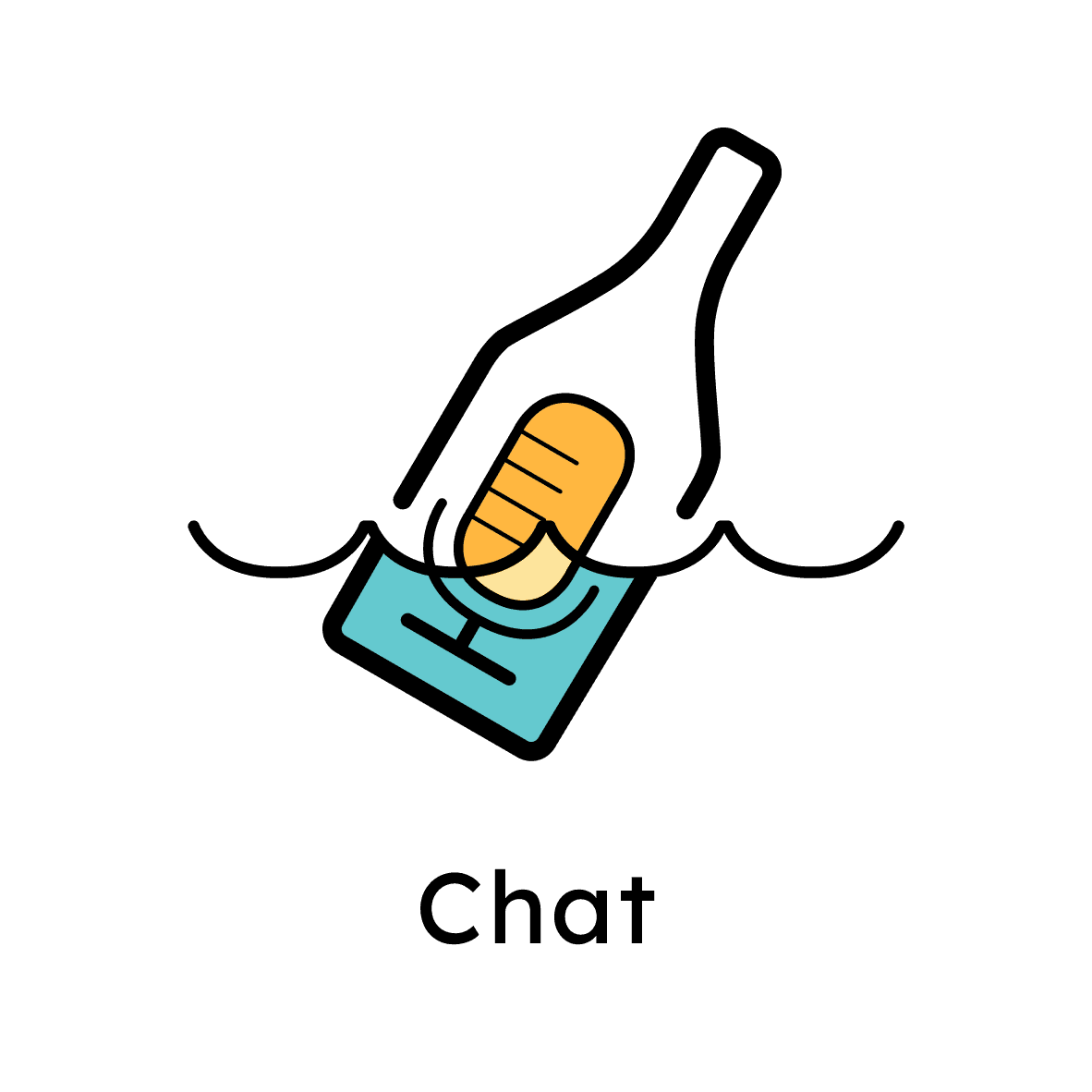
A message in the bottle
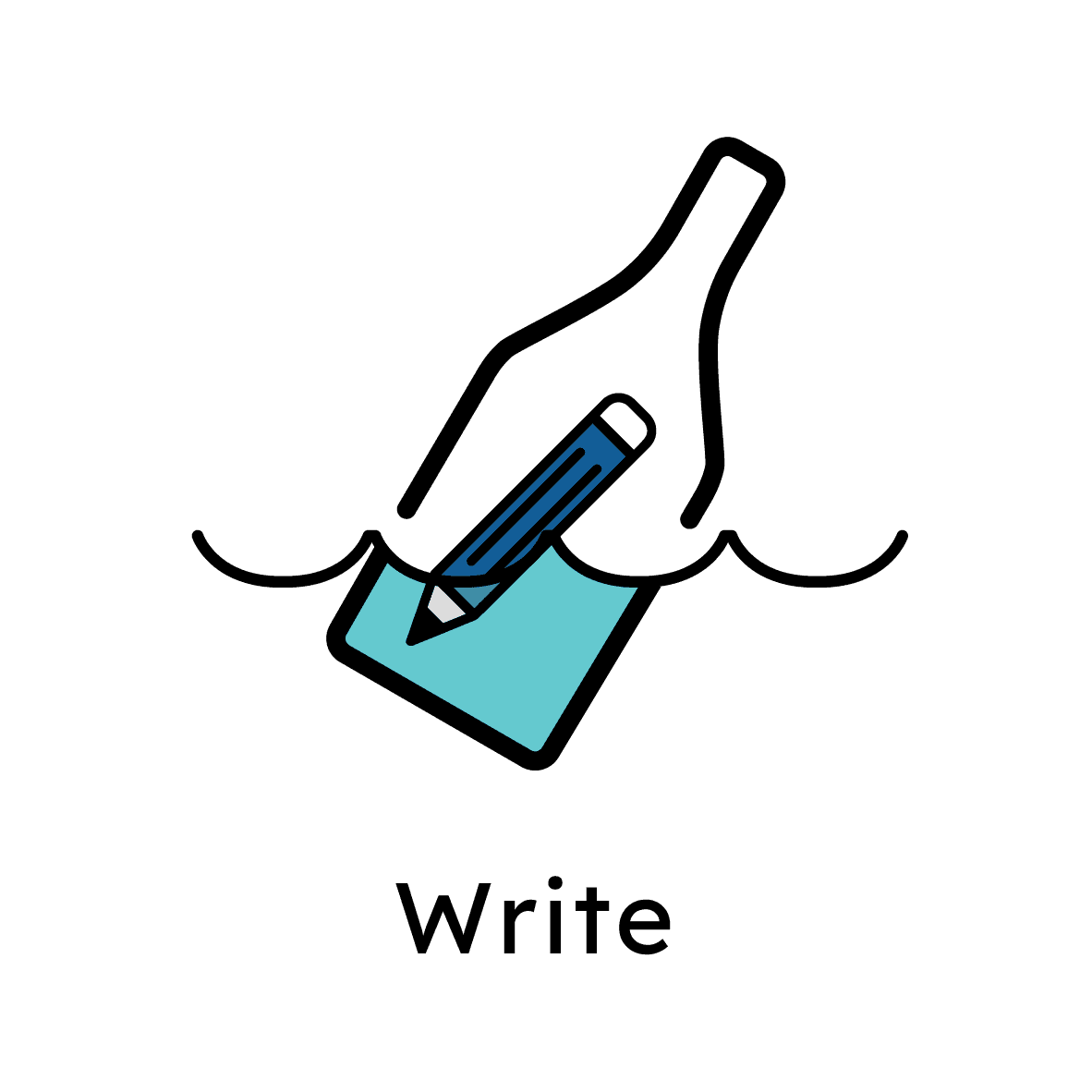
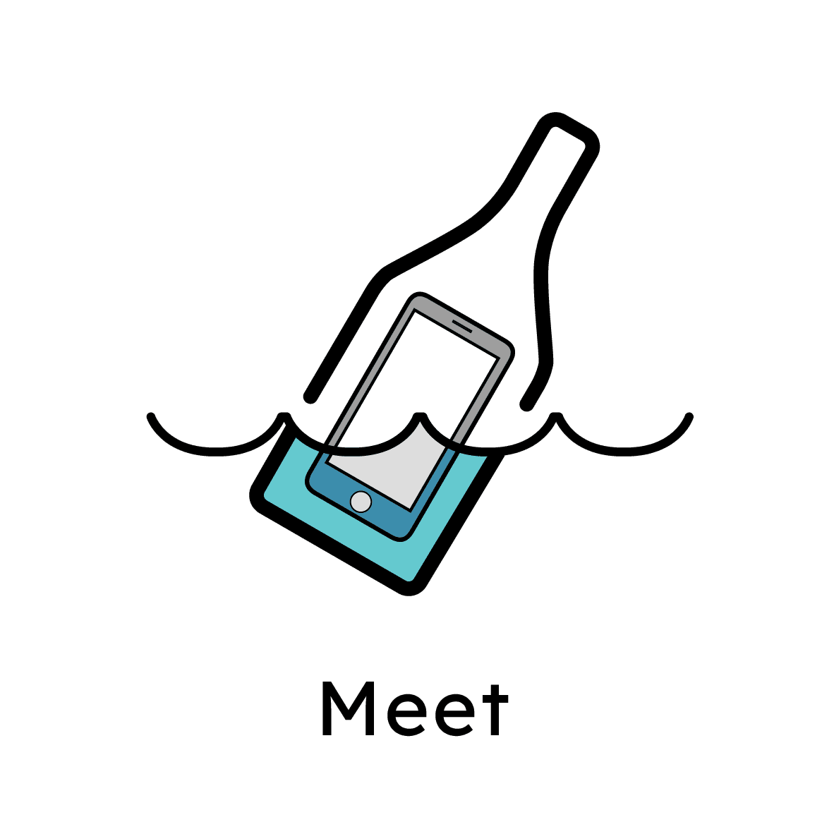
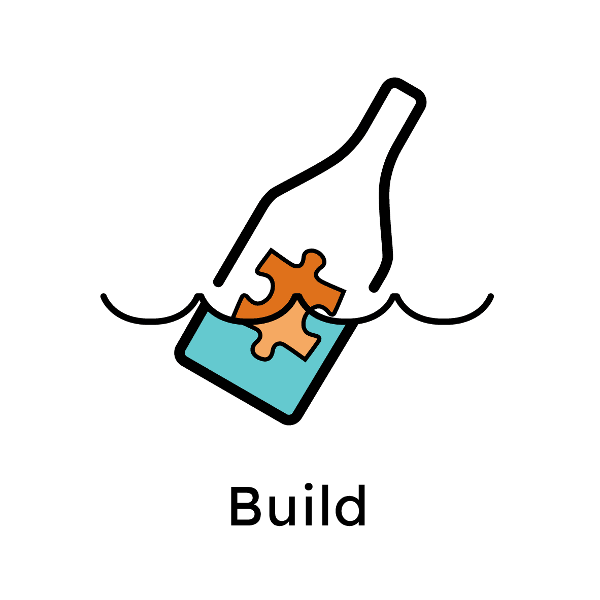
I began with the logo design, which is a message in a bottle, to capture the essence of connecting different generations through a simple yet powerful visual. I extended this theme into the icon of the rest of key sections and overall visual design for the platform, incorporating elements that resonated with the oceanic setting.
Launching Video
Outcome and Key Results
Oceanside Perspective has reached the following results since its launch in August 2022.
85%
User Satisfaction Rate
$10,000
Kickstarter Fundraising Goal Achieved
24%
User growth
Develop
Design System
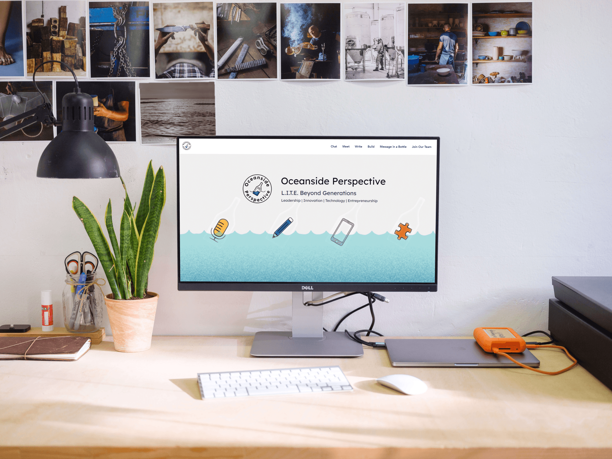
I collaborated closely with OP's founder team to align the visual design with the platform's branding image. This involved understanding OP's founding story and its vision for the digital platform, which includes sections such as video/audio contents, Message in a Bottle, Join Our Team, and About Us. I extended the 'message in the bottle' theme into the icon of key contents and overall visual design for the platform, incorporating elements that resonated with the oceanic setting.
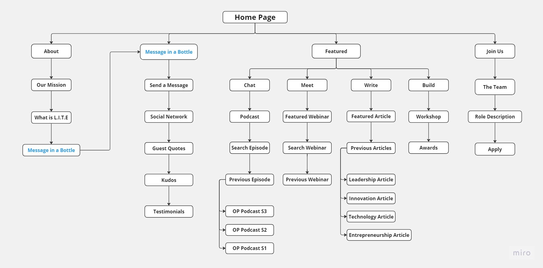
Information Architecture
Clear site navigation for users across channels
The digital platform aimed to cater to various user groups, such as podcast listeners, students, industrial peers, and startups. I conducted a card-sorting study with fellow students and followers of OP to uncover users' mental models of the information architecture of the platform.
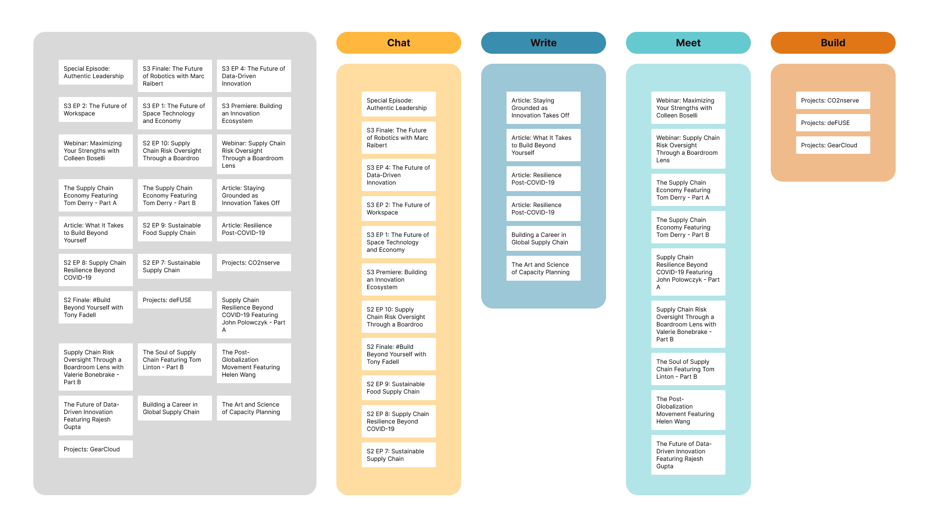
Analyse card sorting data
The card sorting study helped me to identify 4 categories of contents: Chat (podcasts), Meet (videos), Write (articles), and Build (workshops). For example, webinars were grouped together by 76% of participants under Meet section. Collaborated with the website designer, we set up the content strategy for site navigation.
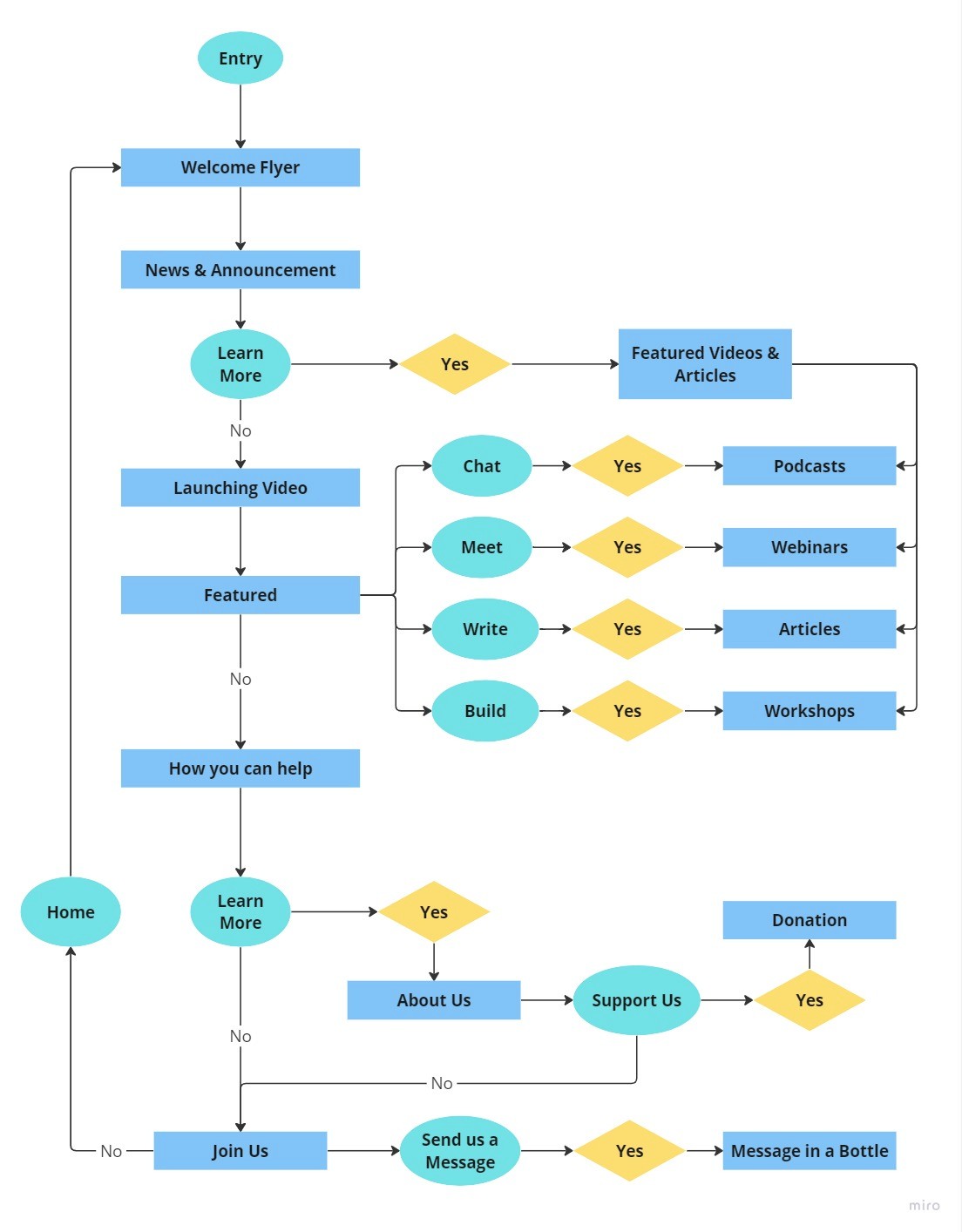
Wireframe + Prototypes
Easy access to information
For each section of the website, we added a landing page for each page with a brief introduction, providing user guidance and enabling easy navigation to the information they needed.
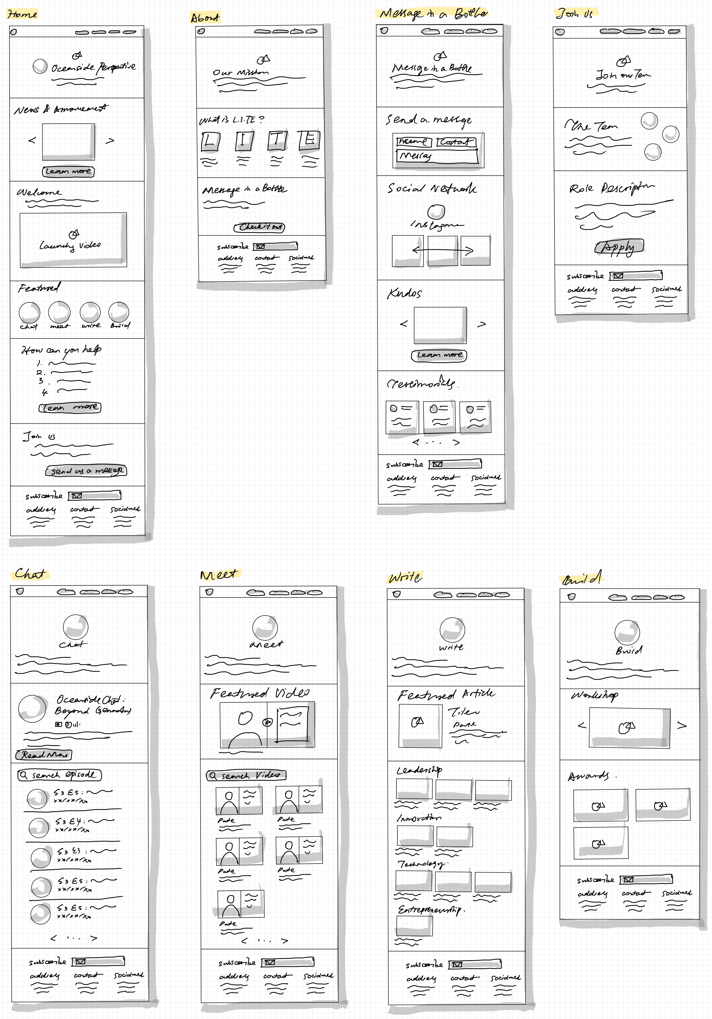
OP's Website Wireframe
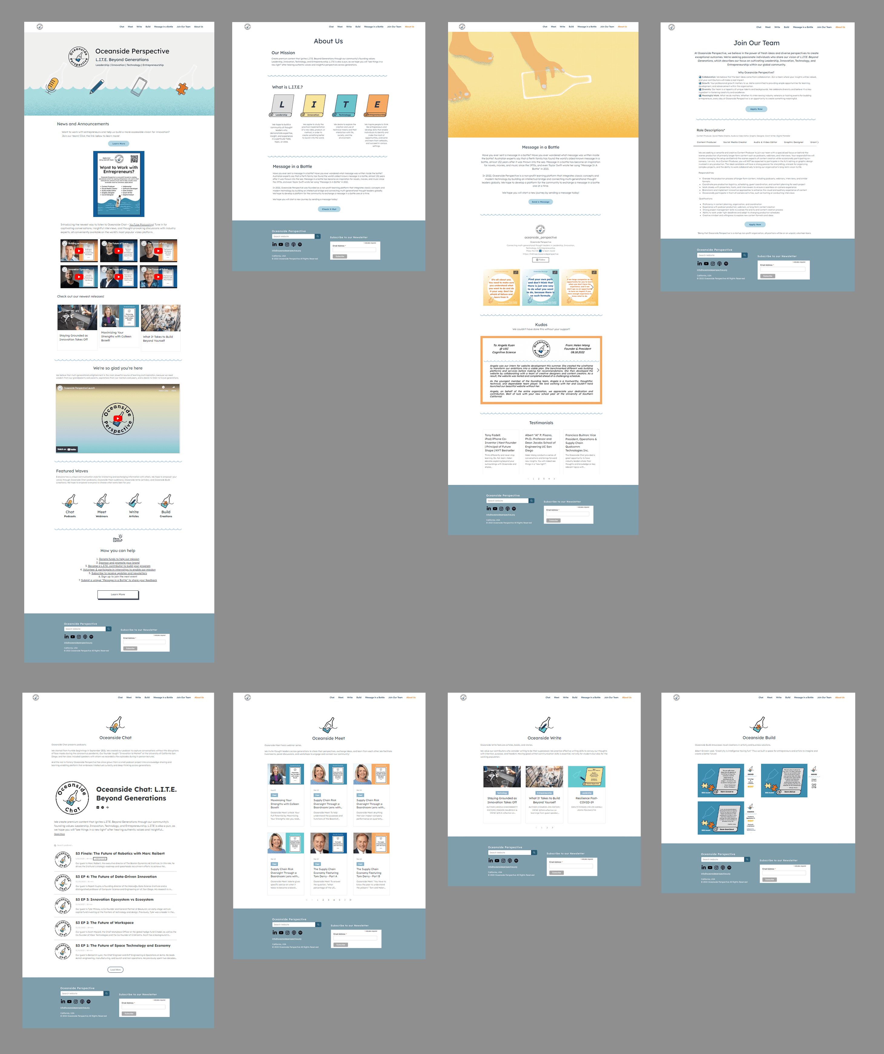
OP's Website High-fidelity Map
View Launched Website
Testing & Iteration
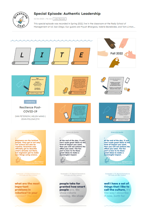
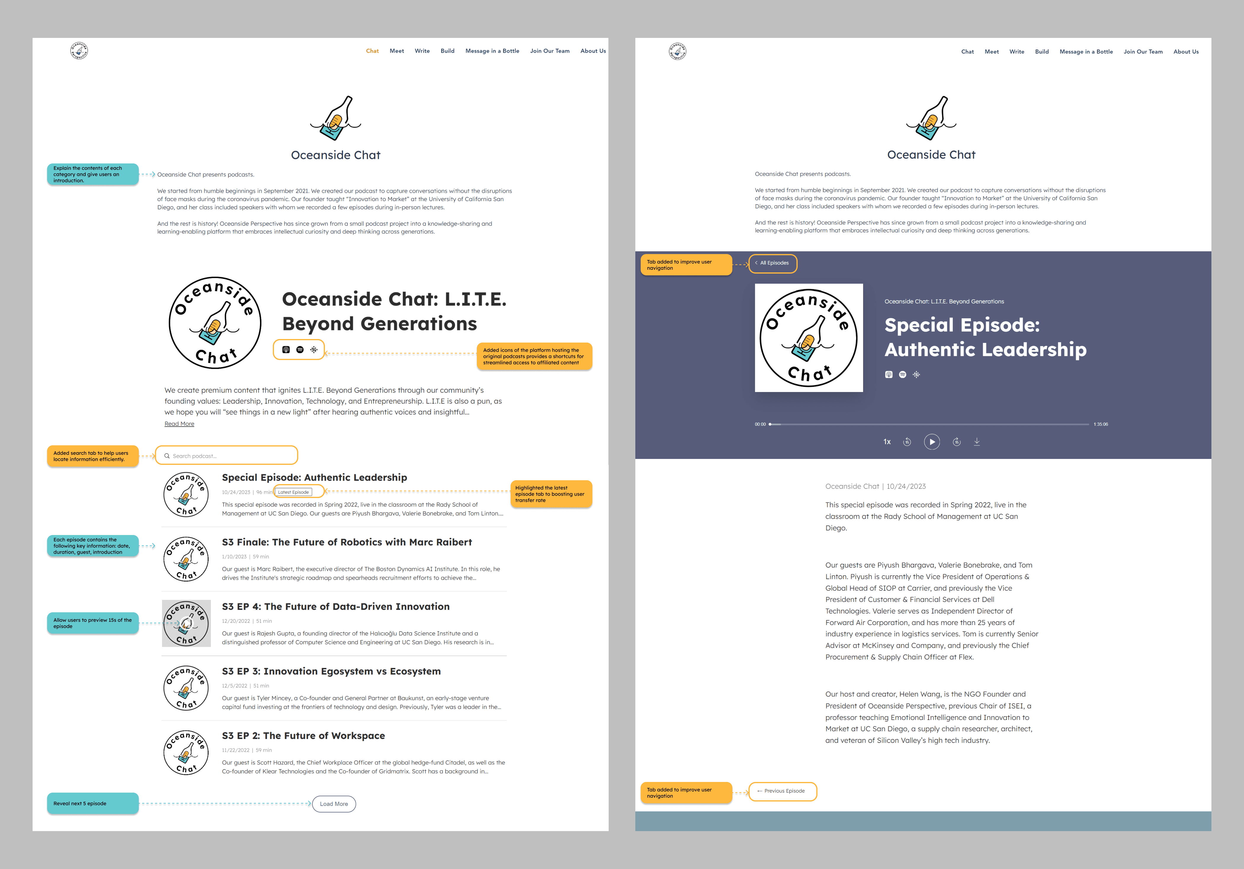
Chat content page
Adding search tab to improve usability & accessibility
After the platform launch, to accommodate the growing contents from affiliated podcasts and YouTube channel, we received user feedback requesting a search function. This addition helps users navigate the increasing complexity and find information efficiently. It's especially beneficial for users with disabilities or those using assistive technologies, enabling them to quickly access relevant content.
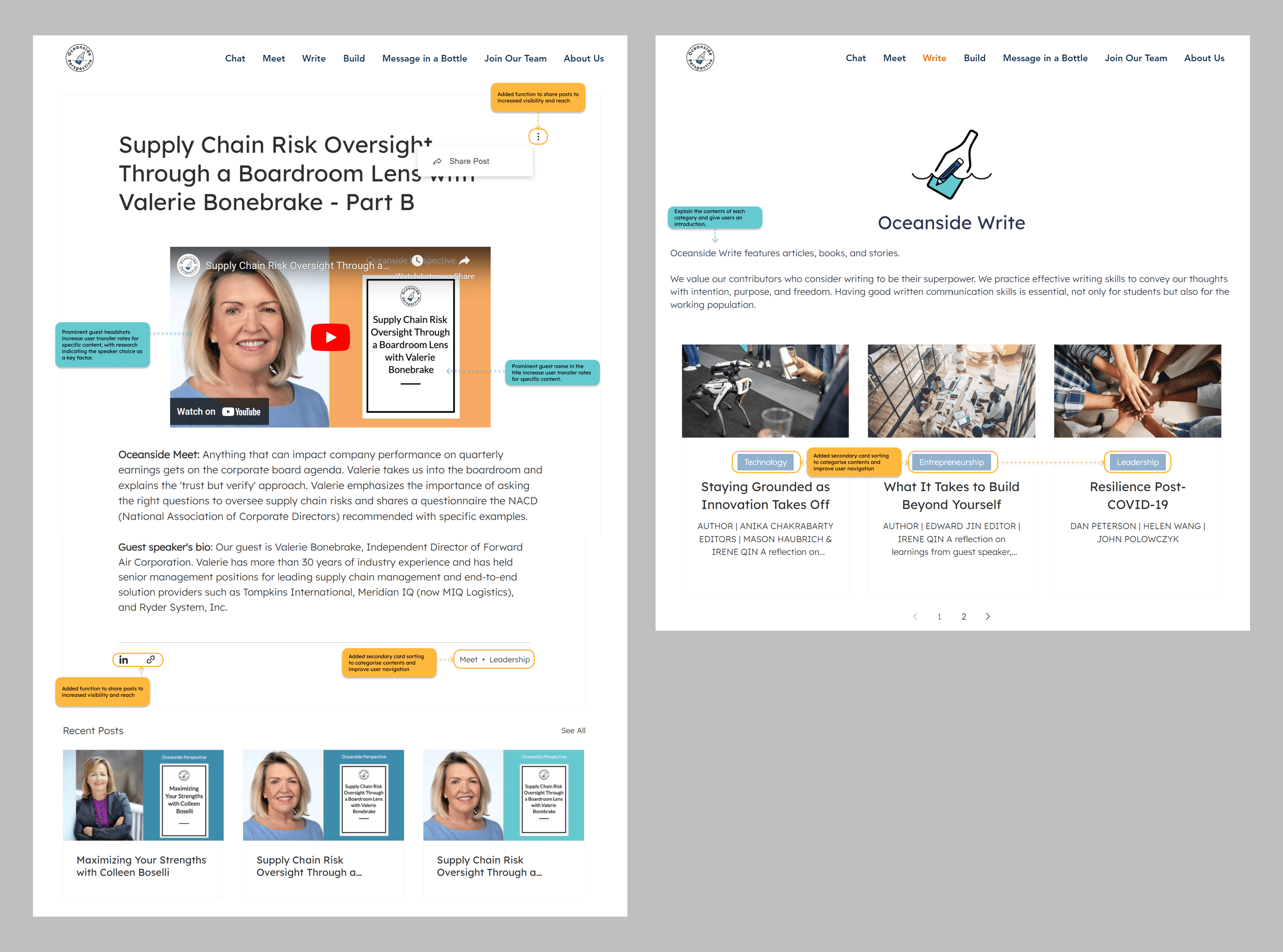
Meet/write page
Post-sharing to increased user visibility
With the establishment of other social platforms, we've integrated a post-sharing function on the website, enhancing brand awareness and potentially driving traffic back to the original platform.
Secondary card sorting
To prepare for the increase contents, volume, we've implemented a secondary card sorting system to divide content into four categories: leadership, innovation, technology, and entrepreneurship, aligning with the organisation's slogan.
Marketing Campaign
Inspirational Quotes
The platform was successfully launched in August 2022. To boost traffic and audience engagement, we introduced the Inspirational Quote feature on OP's website and social media platforms. We picked inspiring quotes from our guests and turned the audio into moving text. This component has become one of the key elements of OP's marketing strategy, leading to its continuous user growth by 24%.
Mainwhile, I collaborated with OP's marketing team to establish a unified visual branding strategy across its communication channels. This approach, beyond design, contributed to a successful Kickstarter fundraising goal of $10,000 within one month after the platform launch.
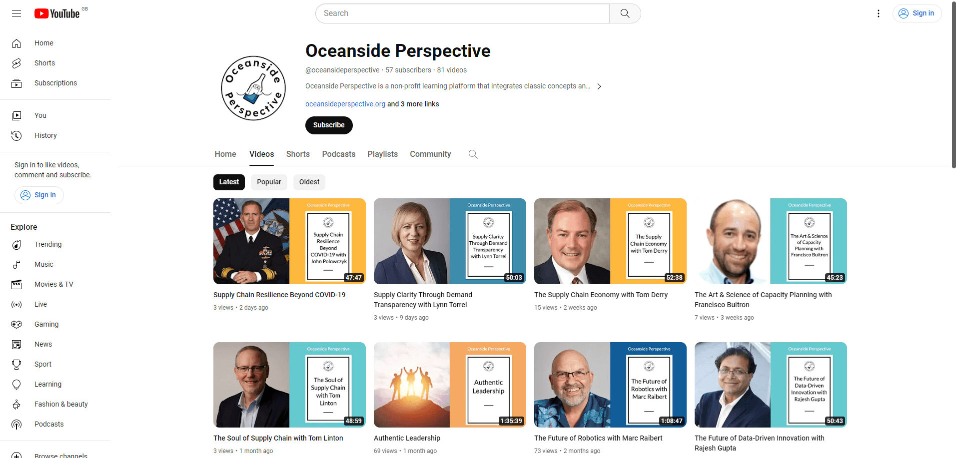
OP's YouTube Channel
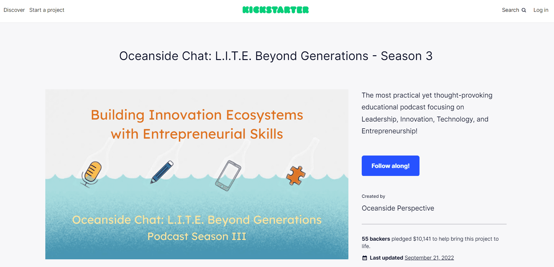
OP's $10K Kickstarter Goal Achieved
Reflection
My Contribution
Design System (logo, graphic, launching video, brand visual guideline)
UX/UI Design (prototypes, website UI design)
Fund Raising/Marketing Champion (graphic/video templates for OP's social media channels)
Project Management (guiding a diverse team to launch a digital platform)
Challenges and Takeaways
Onboarding Members from Diverse Background
Workshops aligned diverse skill sets and overcame time zone obstacles, while collaborative tools like Miro, Google Slides, and Zoom enabled efficient progress tracking and consistent communication.
Increase User Research
Moving forward, we aim to continue using collaborative methods and refine metrics, integrating more extensive user research to enhance the overall user experience and platform impact.
Online Team Building Workshop
Next Projects
All Projects
© 2026 by Lynn Qian